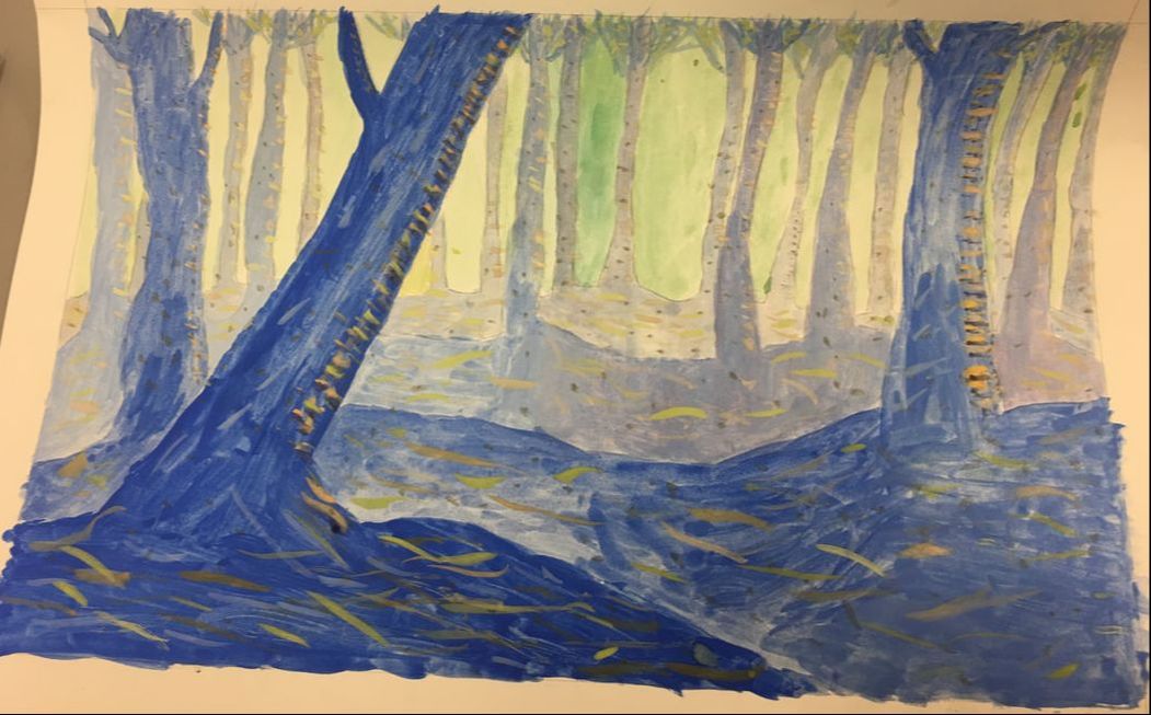
 This is a painting of spooky trees. In this painting, I tried to use brush texture and complementary colors to emphasize the forms of the forest. I used color, value and patterns in order to create a convincing forest that uses balance, pattern and harmony. Overall, this piece gives off the feeling of a still forest.
0 Comments
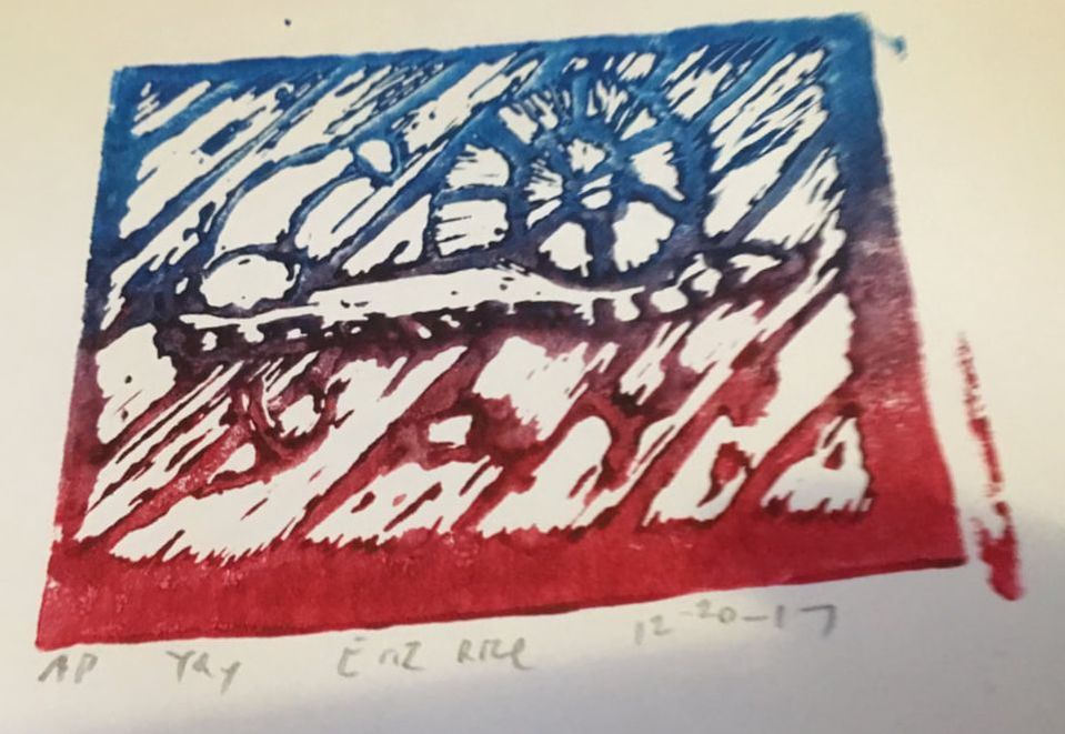 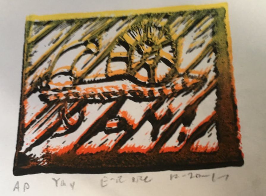 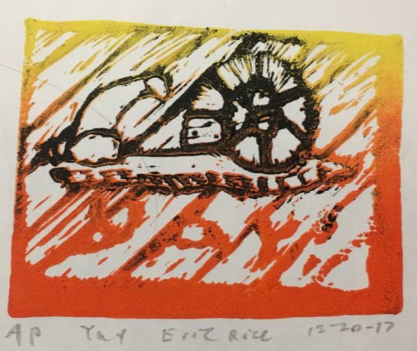 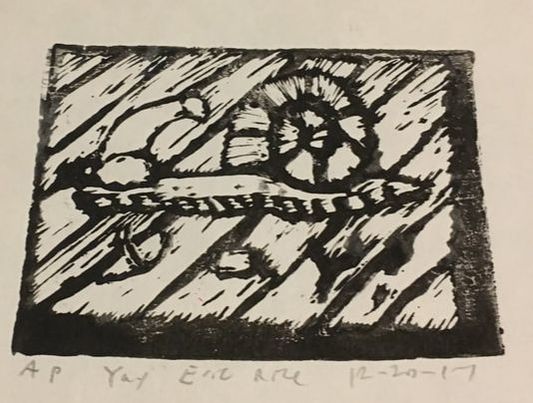 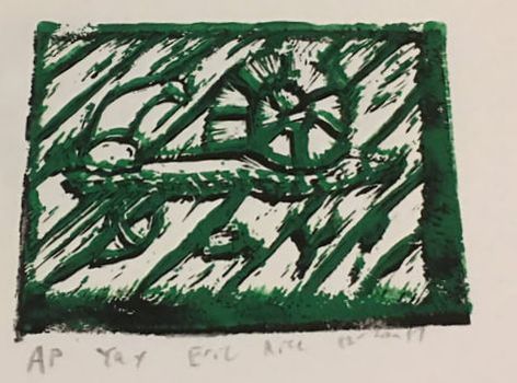 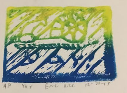 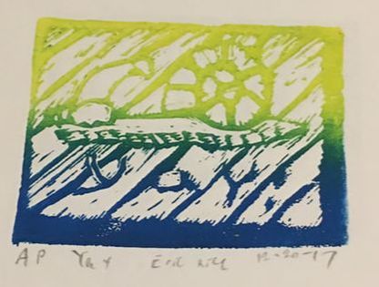 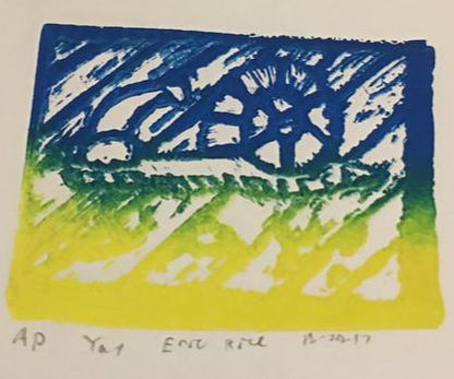 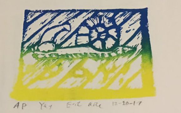 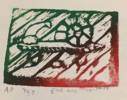 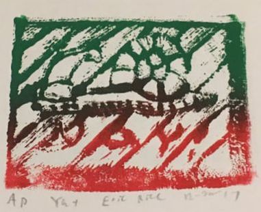 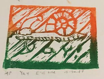 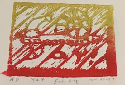 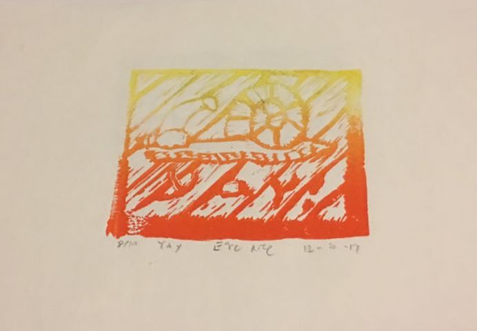 This is a series of block prints of a snail with a Christmas hat on, with "yay!" below it. The first 13 are all artist prints, while the final yellow/orange one is the color scheme I decided to use for my final set. The basic idea of this exercise was to get the hang of rolling paint, pressing prints, and to experiment with different colors to make different designs, and these were also meant for holiday cards. We were also supposed to carve texture into the block to try to give the image form. Overall, these prints give off a feeling of "yay!".
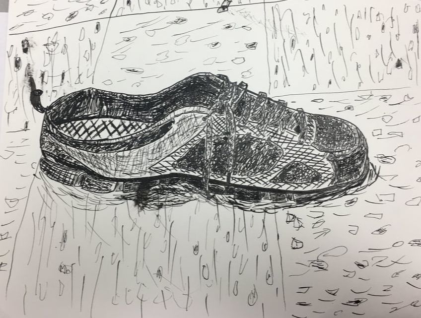 This is a dip pen drawing of a shoe. It is intended to show the effects of using lines and patterns in order to give it texture. Shadows are also used to try to emphasize it's form and show lighting, but it doesn't do that too terribly well. Overall, this picture has a sort of chaotic feeling to it, where there are a lot of lines and scribbles that don't have even thickness or great straightness.
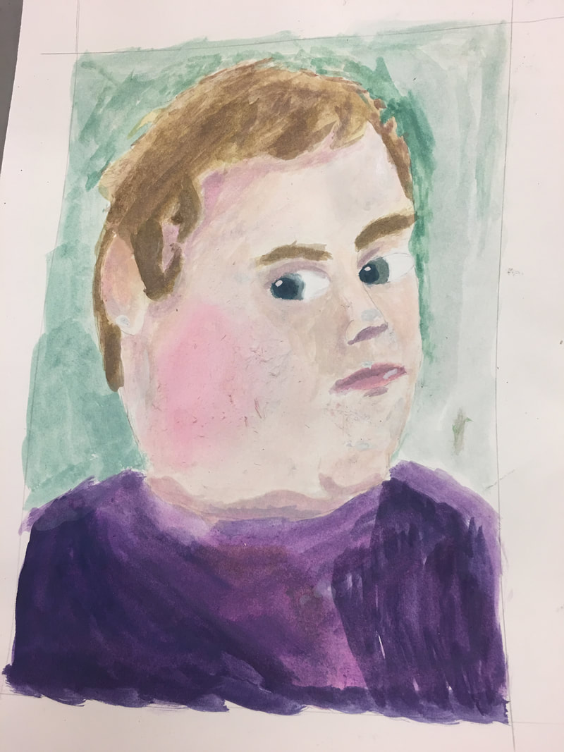 This is a 3/4 perspective painting of a face made from a photo. When making this, I tried to pronounce the form of the face by using complementary colors and textures to varying effect, as the proportion may be off. In order to emphasize brighter features such as the eyes or lips, a shine was added. Overall, I feel that this image gives a sort of bizarre, or weird feeling, as this painting kind of fits into the uncanny valley.
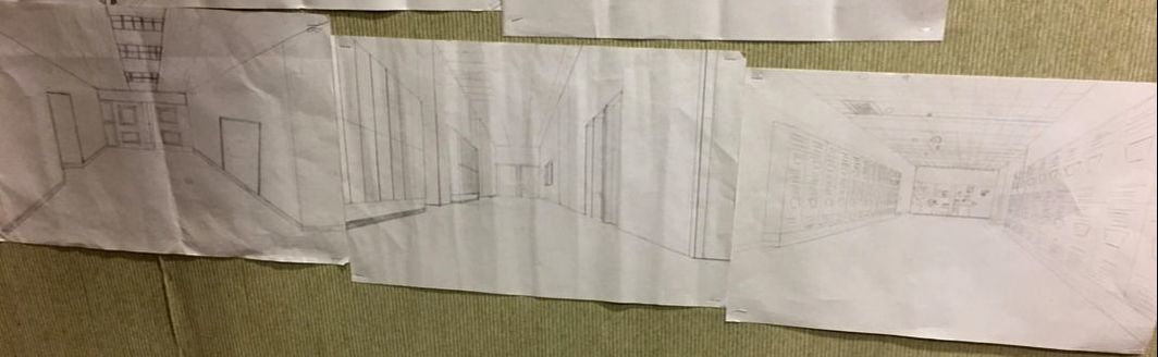 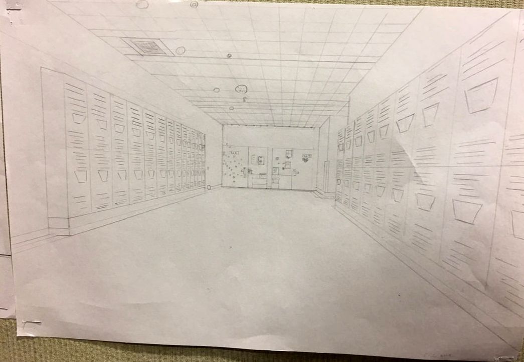 These are a set of perspective pencil drawings of hallways at school, where the one I drew is on the right with a second picture to focus on it. This was created to portray hallways connecting together, each with a one-point perspective. In my drawing, I attempted to show space by changing the proportion of parts of the halls to be smaller the closer it gets to the center, or the vanishing point. One way I set this up was to make all lines that would normally be flat at eye level become slanted towards the vanishing point, which gives off a convincing illusion. While my partners may not necessarily have the same set perspective their drawing was taken from, they do link up at the corners of the halls. Overall, this image gives off the feeling of order (at least with the lockers, as they all fit together and go towards the vanishing point).
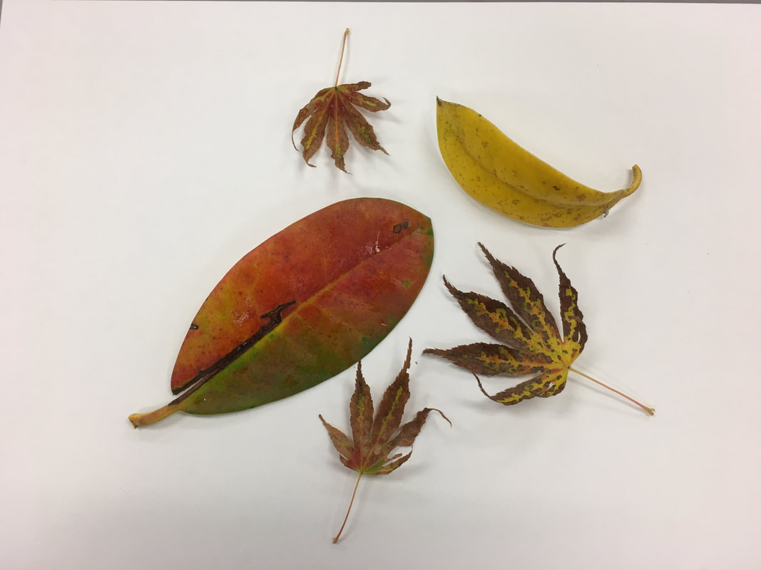 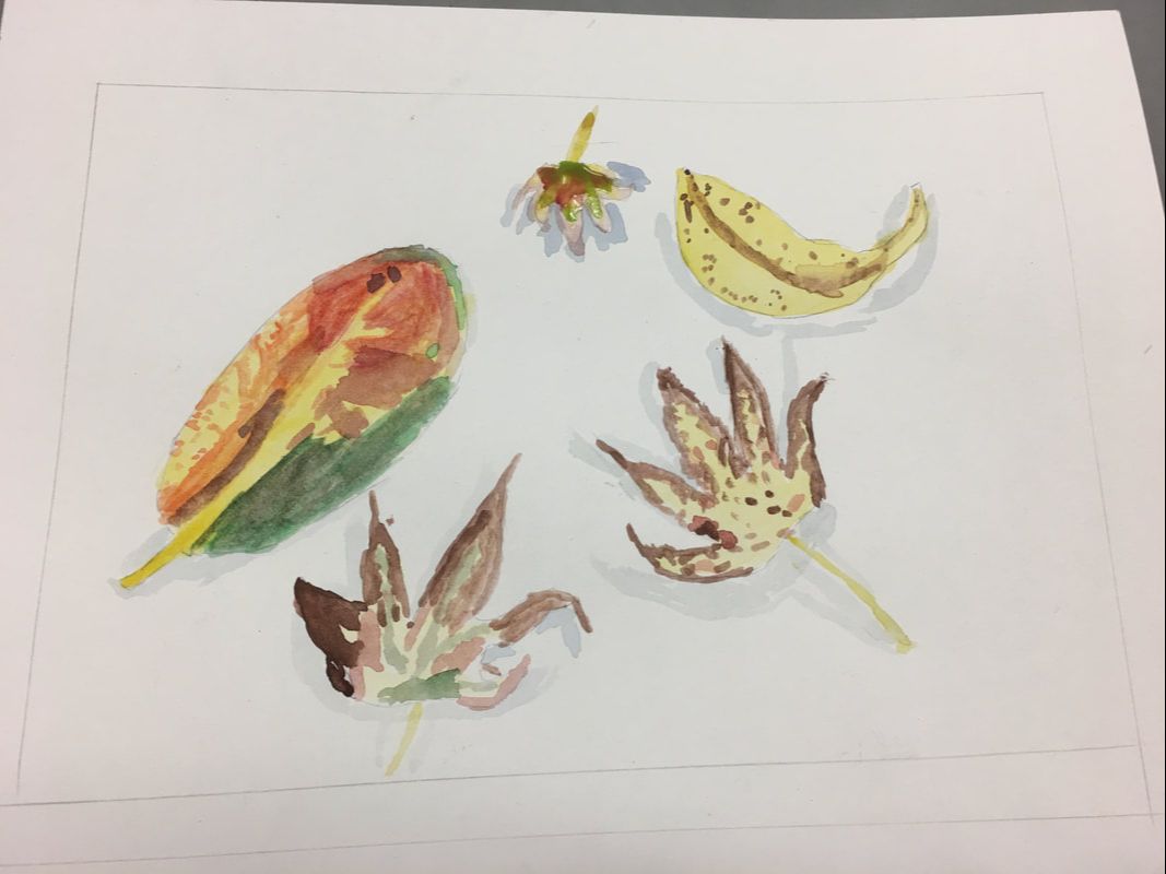 This is a water color painting of an assortment of leaves. It was made to try to demonstrate how water colors interact with each other and mix, which is why light colors should be painted before dark colors, as lighter colors don't show on top of darker colors. I also tried to illustrate the form of the leaves by placing shadows beneath them. Another intentional aspect was color choice for the shadows because if the shadows were darker than they are depicted, it might take away from the emphasis of the leaves, or where their shape starts or stops. Choosing a light gray means that it does not draw any attention away from the colors of the leaves and it fits into the white background. Overall, this image gives off a sense of organization. Even though each pattern within the leaves may appear almost random, they are all contained each within their own shape without spilling over.
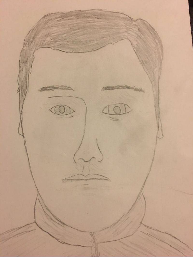 This is a pencil drawing of a face. It was created to show how a room would be made with a one-point perspective in mind. In the drawing, I tried to make the forms in the room apparent in order to create space and scale, showing the distance between the objects as an actual 3D space, rather than a 2D plane. This image gives off the feeling of being small, as the glass of water is emphasized with everything else seeming so far away.
|
AuthorEric (ME!) Archives
January 2018
Categories |
 RSS Feed
