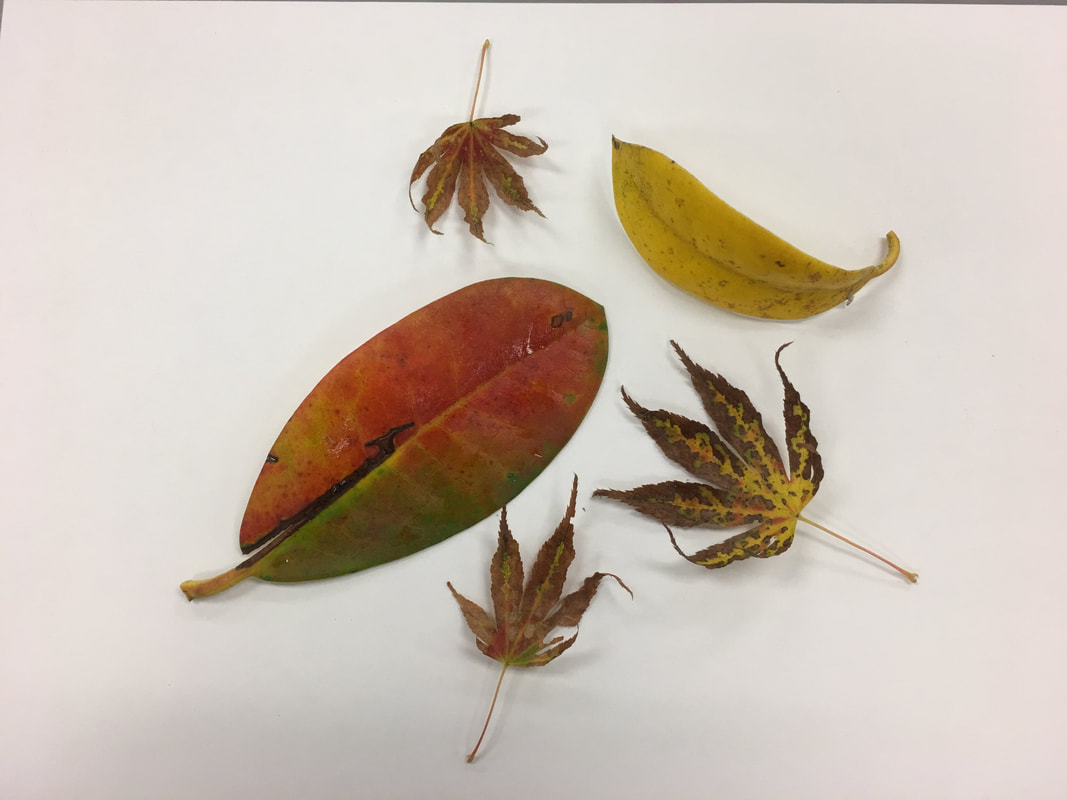
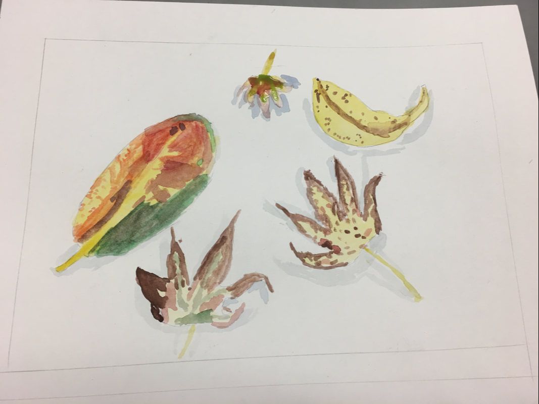
  This is a water color painting of an assortment of leaves. It was made to try to demonstrate how water colors interact with each other and mix, which is why light colors should be painted before dark colors, as lighter colors don't show on top of darker colors. I also tried to illustrate the form of the leaves by placing shadows beneath them. Another intentional aspect was color choice for the shadows because if the shadows were darker than they are depicted, it might take away from the emphasis of the leaves, or where their shape starts or stops. Choosing a light gray means that it does not draw any attention away from the colors of the leaves and it fits into the white background. Overall, this image gives off a sense of organization. Even though each pattern within the leaves may appear almost random, they are all contained each within their own shape without spilling over.
0 Comments
Leave a Reply. |
AuthorEric (ME!) Archives
January 2018
Categories |
 RSS Feed
